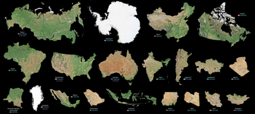


All world maps rely on projecting the Earth’s spherical surface onto a plane which makes it hard to compare relative sizes of territories. Globes are equally difficult to use for this purpose. This means that people perceive territory sizes incorrectly.
Is Greenland the size of the entire African continent?
No…
But looking at a map based on the Mercator projection, you would think so.
Today’s infographic comes from the design studio Art. Lebedev and shows the true size of the world’s landmasses in order from largest to smallest using data from NASA and Google.
Check out the actual shape and size of each landmass without any distortions.
View the full-resolution version of this infographic

Maps can deceive your eyes but they are still powerful tools for specific purposes. In 1569, the legendary cartographer, Gerardus Mercator, created a new map based on a cylindrical projection of sections of the Earth. These types of maps were suited for nautical navigation since every line on the sphere is a constant course or loxodrome.

Despite the map’s nautical utility, the Mercator projection has an unwanted downside. The map type increases the sizes of landmasses close to the poles (such as in North America, Europe, or North Asia) as a side effect. As a result, Canada and Russia appear to take up approximately 25% of the Earth’s surface, when in reality these nations only occupy 5%.
“Things are not always what they seem; the first appearance deceives many.” – Phaedrus
This collection of images above represents the world’s landmasses in their correct proportions. Measurements are based on Google Maps 2016 and NASA Earth Observatory maps, with calculations based on the WGS84 reference ellipsoid, or more simply, a specific model of the Earth’s shape in two dimensions.
We take for granted Google Maps and satellite imaging. Making these accurate representations is no small task – the designers went through six steps and many different iterations of the graphic.
Countries are arranged by descending size and shown without external or dependent territories. For example, the total area for the contiguous United States shown does not include Hawaii, Alaska, or overseas territories.
Although Mercator maps distort the size of landmasses in the Northern Hemisphere, many of these countries still cover massive territories.

The top 10 landmasses by size account for 55% of the Earth’s total land. The remainder is split by the world’s 195 or so other countries.
Here are the 10 tiniest jurisdictions highlighted on the map:

While the Earth’s land surface has been claimed by many authorities, the actual impact of human activity is less than one would think.
Political borders have claimed virtually every piece of land available. Despite this, only 20% of land on the planet has been visibly impacted by human activity, and only 15% of Earth’s land surface is formally under protection.
The remaining 80% of the land hosts natural ecosystems that help to purify air and water, recycle nutrients, enhance soil fertility, pollinate plants, and break down waste products. The value of maintaining these services to the human economy is worth trillions of U.S. dollars each year.
While some nations are not as big as they look on the map, every piece of land counts.
