x


Accumulation/Distribution Indicator (A/D)
MACD Indicator Explained
Fibonacci Levels
By CORY MITCHELL Reviewed by CHARLES POTTERS Updated May 17, 2021
The accumulation/distribution indicator (A/D) is a cumulative indicator that uses volume and price to assess whether a stock is being accumulated or distributed. The A/D measure seeks to identify divergences between the stock price and volume flow. This provides insight into how strong a trend is. If the price is rising but the indicator is falling it suggests that buying or accumulation volume may not be enough to support the price rise and a price decline could be forthcoming.
begin{aligned}&text{MFM} = frac {(text{Close} - text{Low} ) - ( text{High} - text{Close} ) } {text{High} - text{Low} } \&textbf{where:}\&text{MFM} = text{Money Flow Multiplier} \&text{Close} = text{Closing price} \&text{Low} = text{Low price for the period} \&text{High} = text{High price for the period} \ end{aligned}
MFM=High−Low (Close−Low)−(High−Close)
Where: MFM=Money Flow Multiplier
Close=Closing price
Low=Low price for the period
High=High price for the period
begin{aligned}&text{Money Flow Volume} = text{MFM} times text{Period Volume} \ end{aligned}
Money Flow Volume=MFM×Period Volume
A/D=Previous A/D+CMFV
where:CMFV=Current period money flow volume
How to Calculate the A/D Line
The A/D line helps to show how supply and demand factors are influencing price. A/D can move in the same direction as price changes or it may move in the opposite direction.
The multiplier in the calculation provides a gauge for how strong the buying or selling was during a particular period. It does this by determining whether the price closed in the upper or lower portion of its range. This is then multiplied by the volume. Therefore, when a stock closes near the high of the period's range and has high volume, it will result in a large A/D jump. Alternatively, if the price finishes near the high of the range but volume is low, or the volume is high but the price finishes more toward the middle of the range, the A/D will not move up as much.
The same concepts apply when the price closes in the lower portion of the period's price range. Both volume and where the price closes within the Period's range determines how much the A/D will decline by.
The A/D line is used to help assess price trends and potentially spot forthcoming reversals. If a security's price is in a downtrend while the A/D line is in an uptrend, the indicator shows there may be buying pressure and the security's price may reverse to the upside. Conversely, if a security's price is in an uptrend while the A/D line is in a downtrend, the indicator shows there may be selling pressure, or higher distribution. This warns that the price may be due for a decline.
In both cases, the steepness of the A/D line provides insight into the trend. A strongly rising A/D line confirms a strongly rising price. Similarly, if the price is falling and the A/D is also falling, then there is still plenty of distribution and prices are likely to continue to decline.
Both of these technical indicators use price and volume, albeit somewhat differently. On balance volume (OBV) looks at whether the current closing price is higher or lower than the prior close. If the close is higher, the period's volume is added. If the close is lower, then the period's volume is subtracted.
The A/D indicator doesn't factor in the prior close and uses a multiplier based on where within the period's range the price closed. Therefore, the indicators use different calculations and may provide different information.
The A/D indicator does not factor in price changes from one period to the next, and only focuses on where the price closes within the current period's range. This creates some anomalies.
Assume a stock gaps down 20% on huge volume. The price oscillates throughout the day and finishes in the upper portion of its daily range, but is still down 18% from the prior close. Such a move would actually cause the A/D to rise. Even though the stock lost a significant amount of value, because it finished in the upper portion of its daily range the indicator will increase, likely dramatically, due to the large volume. Traders need to monitor the price chart and mark any potential anomalies like these as they could affect how the indicator is interpreted.
Also, one of the main uses of the indicator is to monitor for divergences. Divergences can last a long time and are poor timing signals. When divergence appears between the indicator and price it doesn't mean a reversal is imminent. It may take a long time for the price to reverse, or it may not reverse at all.
The A/D is just one tool that can be used to assess strength or weakness within a trend, but it is not without its faults. Use the A/D indicator in conjunction with other forms of analysis, such as price action analysis, chart patterns, or fundamental analysis, to get a more complete picture of what is moving the price of a stock.
The Moving Average Convergence Divergence (MACD) is an oscillator-type indicator that is widely used by traders for technical analysis (TA). MACD is a trend-following tool that utilizes moving averages to determine the momentum of a stock, cryptocurrency, or another tradeable asset.
Divergence Divergence (MACD) is an oscillator-type indicator that is widely used by traders for technical analysis (TA). MACD is a trend-following tool that utilizes moving averages to determine the momentum of a stock, cryptocurrency, or another tradeable asset.
Developed by Gerald Appel in the late 1970s, the Moving Average Convergence Divergence indicator tracks pricing events that have already occurred and, thus, falls into the category of lagging indicators (which provide signals based on past price action or data). The MACD may be useful for measuring market momentum and possible price trends and is utilized by many traders to spot potential entry and exit points.
Before diving into the mechanisms of MACD, it is important to understand the concept of moving averages. A moving average (MA) is simply a line that represents the average value of previous data during a predefined period. In the context of financial markets, moving averages are among the most popular indicators for technical analysis (TA) and they can be divided into two different types: simple moving averages (SMAs) and exponential moving averages (EMAs). While the SMAs weight all data inputs equally, EMAs assign more importance to the most recent data values (newer price points).
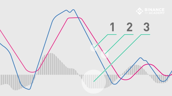
The MACD indicator is generated by subtracting two exponential moving averages (EMAs) to create the main line (MACD line), which is then used to calculate another EMA that represents the signal line.
In addition, there is the MACD histogram, which is calculated based on the differences between those two lines. The histogram, along with the other two lines, fluctuates above and below a centerline, which is also known as the zero line.
Therefore, the MACD indicator consists of three elements moving around the zero line:
In general, the exponential moving averages are measured according to the closing prices of an asset, and the periods used to calculate the two EMAs are usually set as 12 periods (faster) and 26 periods (slower). The period may be configured in different ways (minutes, hours, days, weeks, months), but this article will focus on daily settings. Still, the MACD indicator may be customized to accommodate different trading strategies.
Assuming the standard time ranges, the MACD line itself is calculated by subtracting the 26-day EMA from the 12-day EMA.
MACD line = 12d EMA - 26d EMA
As mentioned, the MACD line oscillates above and below the zero line, and this is what signals the centerline crossovers, telling traders when the 12-day and 26-day EMA are changing their relative position.
By default, the signal line is calculated from a 9-day EMA of the main line and, as such, provides further insights into its previous movements.
Signal line = 9d EMA of MACD line
Although they are not always accurate, when the MACD line and signal line cross, these events are usually deemed as trend reversal signals, especially when they happen at the extremities of the MACD chart (far above or far below the zero line).
The histogram is nothing more than a visual record of the relative movements of the MACD line and the signal line. It is simply calculated by subtracting one from the other:
MACD histogram = MACD line - signal line
However, instead of adding a third moving line, the histogram is made of a bar graph, making it visually easier to read and interpret. Note that the histogram bars have nothing to do with the trading volume of the asset.
As discussed, the default settings for MACD is based on the 12, 26, and 9-period EMAs - hence MACD (12, 26, 9). However, some technical analysts and chartists change the periods as a way to create a more sensitive indicator. For example, MACD (5, 35, 5) is one that is often used in traditional financial markets along with longer timeframes, such as weekly or monthly charts.
It is worth noting that due to the high volatility of cryptocurrency markets, increasing the sensitivity of the MACD indicator may be risky because it will likely result in more false signals and misleading information.
As the name suggests, the Moving Average Convergence Divergence indicator tracks the relationships between moving averages, and the correlation between the two lines can be described as either convergent or divergent. Convergent when the lines gravitate toward one another and divergent when they move apart.
Still, the relevant signals of the MACD indicator are related to the so-called crossovers, which happen when the MACD line crosses above or below the centerline (centerline crossovers), or above or below the signal line (signal line crossovers).
Keep in mind that both centerline and signal line crossovers may happen multiple times, producing many false and tricky signals - especially in regards to volatile assets, such as cryptocurrencies. Therefore, one should not rely on the MACD indicator alone.
Centerline crossovers happen when the MACD line moves either on the positive or negative area. When it crosses above the centerline, the positive MACD value indicates that the 12-day EMA is greater than the 26-day. In contrast, a negative MACD is shown when the MACD line crosses below the centerline, meaning that the 26-day average is higher than the 12-day. In other terms, a positive MACD line suggests a stronger upside momentum, while a negative one may indicate a stronger drive to the downside.
When the MACD line crosses above the signal line, traders often interpret it as a potential buying opportunity (entry point). On the other hand, when the MACD line crosses below the signal line, traders tend to consider it a selling opportunity (exit point).
While the signal crossovers can be helpful, they are not always reliable. It is also worth considering where they take place in the chart as a way to minimize the risks. For instance, if the crossover calls for a buy but the MACD line indicator is below the centerline (negative), market conditions may still be considered bearish. Conversely, if a signal line crossover indicates a potential selling point, but the MACD line indicator is positive (above the zero line), market conditions are still likely to be bullish. In such a scenario, following the sell signal may carry more risk (considering the larger trend).
Along with centerline and signal line crossovers, MACD charts may also provide insights through divergences between the MACD chart and the asset’s price action.
For example, if the price action of a cryptocurrency makes a higher high while the MACD creates a lower high, we would have a bearish divergence, indicating that despite the price increase, the upside momentum (buying pressure) is not as strong as it was. Bearish divergences are usually interpreted as selling opportunities because they tend to precede price reversals.
On the contrary, if the MACD line forms two rising lows that align with two falling lows on the asset price, then this is considered a bullish divergence, suggesting that despite the price decrease the buying pressure is stronger. Bullish divergences tend to precede price reversals, potentially indicating a short-term bottom (from a downtrend to an uptrend).
When it comes to technical analysis, the Moving Average Convergence Divergence oscillator is one of the most useful tools available. Not only because it is relatively easy to use, but also because it is quite effective at identifying both market trends and market momentum.
As most TA indicators, however, the MACD is not always accurate and may provide numerous false and misleading signals - especially in relation to volatile assets or during weak-trending or sideways price action. Consequently, many traders use MACD with other indicators - such as the RSI indicator - to reduce risks and to further confirm the signals.
In general terms, the Fibonacci levels are key levels for potential price reversal areas, or key levels of resistance and support. These levels are 23.6%, 38.2%, 50%, 61.8% and 100% of a move, which are measured with the Fibonacci tool.
The Fibonacci levels that are used within institutional trading are 23.6%, 38.2%, 50%, 61.8%, and 100%. However, the Fibonacci levels more commonly used in cryptocurrency trading is 38.2%, 50%, 61.8%, and 100
How do you interpret Fibonacci retracement?
The Fibonacci retracement levels are all derived from this number string. After the sequence gets going, dividing one number by the next number yields 0.618, or 61.8%. Divide a number by the second number to its right, and the result is 0.382 or 38.2%
How accurate is Fibonacci retracement?
Fibonacci can provide reliable trade setups, but not without confirmation. ... Applying our Fibonacci retracement sequence, we arrive at a 38.2% retracement level of 111.42 (from the 113.94 top). Following the retracement lower, we notice the stochastic oscillator is also confirming the momentum lower.
The Fibonacci Moving Average is an equally weighted exponential moving average using the lookbacks of selected Fibonacci numbers. Here is what I mean step by step: We calculate exponential moving averages using the following lookbacks {2, 3, 5, 8, 13, 21, 34, 55, 89, 144, 233, 377, 610, 987, 1597}
In an uptrend:
They can be used to draw support lines, identify resistance levels, place stop-loss orders, and set target prices. Fibonacci ratios can even act as a primary mechanism in a counter trend trading strategy. ... It shows how much of a prior move the price has retraced. The direction of the previous trend is likely to continue.
The Fibonacci levels, therefore, are a sort of a frame through which traders look at their charts. This frame neither predicts nor contributes anything, but it does influence the trading decisions of thousands of traders. However, Fibonacci studies do not provide a magic solution for traders.
Fibonacci retracements are often used as part of a trend-trading strategy. In this scenario, traders observe a retracement taking place within a trend and try to make low-risk entries in the direction of the initial trend using Fibonacci levels.
How does Fibonacci work in trading?
The Fibonacci sequence is a series of numbers, where a number is found by adding up two numbers before it. ... Fibonacci ratios i.e. 61.8%, 38.2%, and 23.6% can help a trader identify the possible extent of retracement. Traders can use these levels to position themselves for a trade.
SMA calculates the average of price data, while EMA gives more weight to current data. ... More specifically, the exponential moving average gives a higher weighting to recent prices, while the simple moving average assigns equal weighting to all values.
If your day trading strategy provides a short-sell signal in that price region, the Fibonacci level helps confirm the signal. The Fibonacci levels also point out price areas where you should be on high alert for trading opportunities
The golden ratio is about 1.618, and represented by the Greek letter phi, Φ. The golden ratio is best approximated by the famous "Fibonacci numbers." Fibonacci numbers are a never-ending sequence starting with 0 and 1, and continuing by adding the previous two numbers.
noun. : an integer in the infinite sequence 1, 1, 2, 3, 5, 8, 13, … of which the first two terms are 1 and 1 and each succeeding term is the sum of the two immediately preceding. See the full definition.


