x




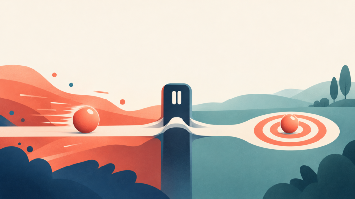

Intentional friction is a deliberate extra step or pause that slows you down just enough to make a conscious choice. It can improve the user experience because it cuts down on mistakes and gives your attention time to catch up.
You have probably sent an email you wished you had read again. You may have bought something at midnight that you never planned to buy. Those moments happen fast, and a small pause could have changed the outcome.
This article covers where to add friction and where to take it out. Good design removes unintentional friction, such as slow pages and confusing menus. It keeps the friction that protects your decisions.
Adding friction at the right moment is a design decision you can make on purpose, not a flaw.
Intentional friction is a deliberate extra step or slower process that you place in a path because it leads to a better decision. The intentional friction meaning comes down to one idea: the step helps you stop and think. Netflix's "Are you still watching?" prompt works this way. It asks for an active choice after a long stretch of viewing without any pause.
Unintentional friction is bad friction, and it should be removed. Slow loading, confusing menus, and form fields you do not need all waste your time. Intentional friction is different because it has a purpose. It protects you from a costly error.
Fast thinking handles easy tasks well, but choices that matter need slow thinking.
Psychologists often call fast, automatic thinking System 1. They call slow, reflective thinking System 2. When a task feels too easy, System 1 takes over and you stop checking what you are doing. Friction brings System 2 back into the moment.
Gmail's Undo Send gives you a 20-second window to take back a sent message. That window is a small pause built into the design. You will find examples, simple rules, and steps for your own habits in the sections ahead.
Ask of any extra step whether it protects a choice or only wastes time.
A one-click purchase or an endless feed is designed to get you to act before you think. Fast action feels natural, so your attention slips past the question of whether you really want the thing. Designers know this, and they use it.
Autopilot is fast and automatic, and it runs without a conscious choice. It is useful for brushing your teeth. It is risky when money, time, or your words are on the line.
Autopilot takes over when a task repeats often enough. Your brain stops checking each step and follows the pattern. Most people can drive home without remembering each turn.
Three habits show autopilot at work:
Frictionless design removes every pause, so you move from the first screen to the last without a stop. That speed helps when the choice is easy. It hurts when you need a quick decision that is also a careful one. Speed can also flatten what you buy and say. A 2026 consumer report found that 75 percent of marketing leaders worry AI-generated content makes brands look alike.
Notice the moments when you act before you finish deciding.
A banking app that asks you to confirm a transfer to a new payee shows intentional friction doing its job. Examples of intentional friction are easy to find once you look for a pause that protects you. The table below shows five cases, from apps to everyday personal habits.
A pause helps most when it sits right before a costly mistake. Each row below adds one step and gives it one clear purpose. Many of these design examples cost nothing to set up.
| Setting | Friction added | Purpose |
| Banking app | Confirm a transfer to a new payee | Stops money from going to the wrong account |
| Deletion dialog | Type the file name before deleting | Prevents deleting the wrong file |
| Phone app timer | Set a 30-minute daily limit | Limits endless scrolling |
| Paper towel roll | Loose end tucked under a rubber band | Makes you pause before tearing off a sheet |
| Phone charger | Charge the phone in the kitchen | Stops late-night scrolling in bed |
Choose one everyday habit this week and add a single step in front of it.

Start by asking whether a step is a task to finish or a decision to make. Tasks such as payment should feel smooth. Decisions, such as choosing a plan or setting up an account, can carry friction. That split is the main rule for intentional friction in design.
Keep payment, navigation, and customer service smooth. Add friction to product selection and onboarding. Onboarding is the first setup a new user completes in an app. A short pause there helps people pick the right settings the first time.
Designers map user flows, which are the steps a person takes through a product. They mark each step as either a task or a decision. A business that sells software may place a "Book a call" button on its pricing page. A short form that asks about company size and budget filters out buyers who are not serious, so the sales team spends time on real leads.
Ask whether a step protects the user or only adds delay. Keep friction where a mistake would be costly and remove it everywhere else.
A deletion dialog should restate the action and say what happens next. A confirmation dialog helps most before a destructive action, which is one that cannot be undone or costs real money or data.
Use a confirmation step only when the action cannot be undone or is costly. Small actions that you can reverse do not need one.
A confirmation dialog helps when a click can delete data, send money, or end a service. It does little good for small actions that you can reverse. Many apps offer undo instead. Gmail's Undo Send lets you take back a sent message for a short time.
Three rules keep a confirmation step useful. Apply them each time you add one.
The button should name the action, such as "Delete account." A dialog with only "Yes" or "No" makes you reread the question to know what you are agreeing to. Specific labels remove that doubt.
Typed confirmation fits only the most critical deletions, where you must type a name or a word before the action runs. Habituation sets in when people see the same dialog so often that they click without reading. Test your confirmation dialog once a month for whether users still read it.

Friction becomes a dark pattern when it keeps you from leaving rather than helping you choose. A dark pattern is a design trick that pushes you toward a choice you did not mean to make.
The test is simple: does the step help you decide, or does it keep you stuck? A step that shows you the price before you pay helps. A step that hides the way out does not.
The Federal Trade Commission (FTC) issued a 2022 staff report on dark patterns. It described designs that hide information and make cancellation hard through long, confusing flows. A 2021 FTC policy statement says cancellation should be at least as easy as purchase. It also says companies should get express consent before they charge you, with clear disclosure first.
A 2023 complaint against Amazon alleged dark patterns in its Prime sign-up and cancellation. These are allegations, not proven findings.
Check how long it takes to cancel compared with how long it took to sign up.
Put one step between you and an app you open without thinking. A small delay is often enough to break the loop. That is how friction can help with phone use you did not choose.
Friction works best when it sits between you and the habit. Use these steps to add friction to a habit you want to drop. Remove it from a habit you want to keep.
Try these steps for habit building and better environment design at home:
Add friction to habits you want to drop, and take it away from habits you want to keep.
Experiment for two weeks and keep only the changes that you still use.
Intentional friction works when it protects a choice you would otherwise make on autopilot. Friction should guard a decision. It should never block your way out of a service or a room.
Pick one place in your product or your day this week where a single extra step would help.