
A Beginner’s Guide to Cryptocurrency Charts

The content of this article is for information purposes only and is not investment advice or any form of recommendation or invitation. We always advises you to obtain your own independent financial advice before investing or trading in cryptocurrency.
The world of cryptocurrency can be overwhelming when you’re getting started. There’s a million buzzwords to get your head around, and once you’ve got to grips with those, they hit you with the charts. The endless, endless charts.
If you’re looking to become a fully-fledged crypto trader, though, these charts can be an incredibly powerful tool when used correctly. Knowledge is power, and for many traders, charts are integral to their decision-making process.
A crypto chart is simply a visual tool that displays relevant data in such a way as to help you understand cryptocurrency price movements.
The way the data is plotted can help you see patterns in market movements identify trends as they form and help you to build a picture of the overall momentum of the market – whether bullish (people are buying and the price is going up) or bearish (people are selling and the price is going down). The theory is that this can then be used to help predict where the market is going and what the price will be in the future so you know when to buy, when to sell, and when to HODL.
There are two main formats of price charts used: line charts and candlestick charts. We’ll start with line charts.
A linear line chart
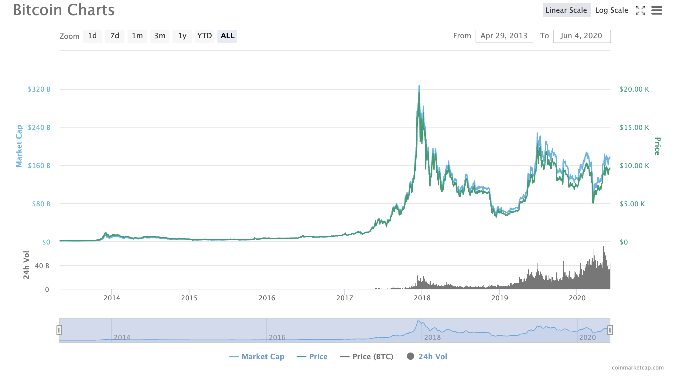
Line charts are the most basic kind of crypto chart. Line charts display the historical price points of an asset. You’ll see a green line on the chart above. This relates to the scale of the right hand side, representing BTC’s price in USD (though it can display any local currency). For cryptocurrencies, these are generally made up of the daily closing prices within a particular time frame. Time frames for chart viewing can be measured in whatever length you want to see, whether minutes, hours, days, weeks, months, or years. If you are an experienced trader, you’ll likely want to focus on minutes and hours. If you’re a HODLer looking for longer-term investment, monthly will be more suitable.
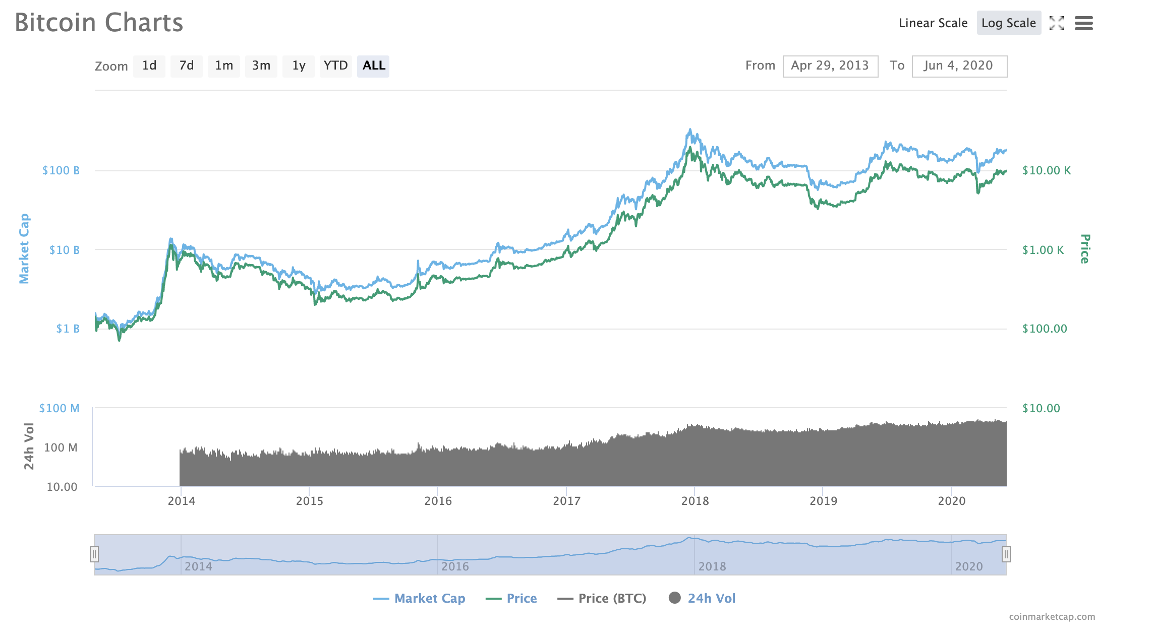
It’s also important to remember that line charts come in two different scales: linear and logarithmic. You can easily alternate between these by toggling between them (top right hand corner of the graph above, but this will vary). In the linear chart, the price scale is divided into equal pieces. In the log chart, the crypto price is scaled according to percent changes, so if two price changes are different in absolute value yet equal in percentage, they will both be represented by the same vertical shift on the log scale. Both charts have their uses. With a linear chart, you can better judge the speed of price changes, whereas log charts make it easier to identify trends.
A logarithmic line chart
On the left-hand side of the chart, you’ll see an axis for Bitcoin’s market cap. This is shown by the blue line. Bitcoin’s market cap simply refers to the total value of all the Bitcoin that has been issued. It’s calculated by multiplying the total number of Bitcoins in circulation by the Bitcoin price. This is a good indicator of how investors currently view Bitcoin.
At the bottom of the chart, you’ll find a black line representing historical 24h trading volumes. This can be a useful indicator of whether or not a surge in prices can be sustained. Lower volume means that there is less conviction in the market and a surge outbreak is built on weaker foundations, so the price is more likely to collapse straight back down. Higher volume, meanwhile, increases the likelihood that there is some genuine momentum in an upwards price swing.
The candlestick chart is a more advanced trading tool containing additional useful information. It is popular among crypto traders for use in technical analysis. You can read more about technical analysis here.
A candlestick chart
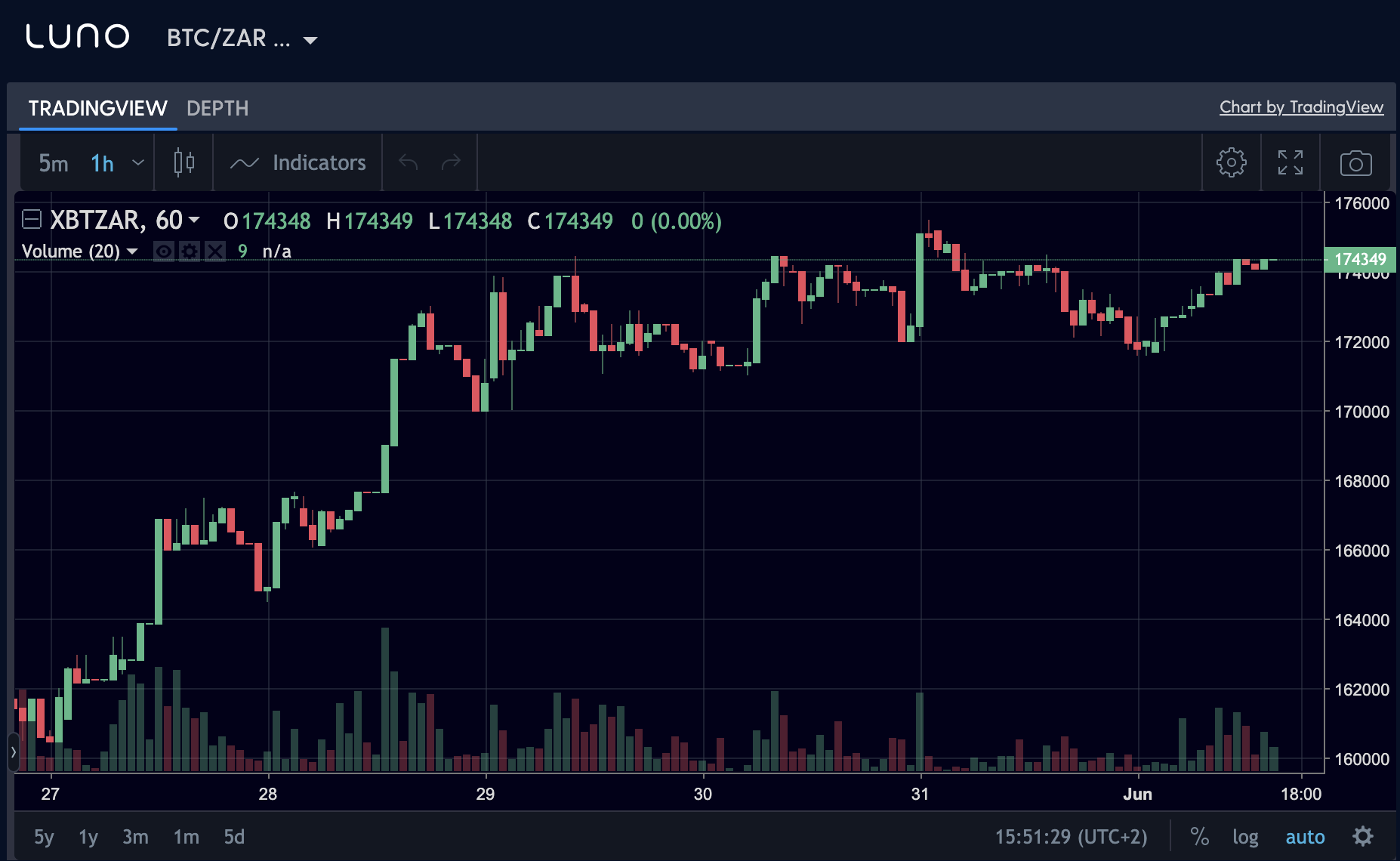
Candlestick charts can seem intimidating at first but they’re easy to understand once you get the hang of reading them. On the x-axis, you’ll find the time and on the y-axis, you’ll find the price. So far, so similar to the line chart. The big difference is the candlesticks.
The candlestick chart is so-called because each plot point on the graph looks like a candlestick. They are rectangles that are either red (or pink) or green and have a line coming out of the top or bottom, like the wick of a candle. The size of the candlestick, the wick, and the colour provide you with an array of useful information.
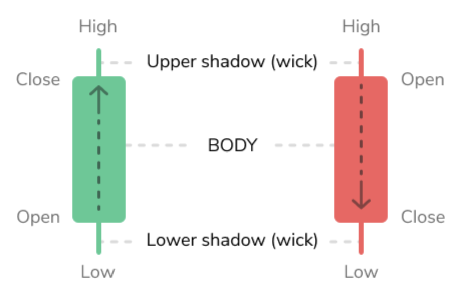
The rectangle itself shows the gap between the opening and closing balance for that coin during the period you are searching. Green candlesticks indicate that the crypto rose in value so the opening price is at the bottom and the closing price is at the top. Red (or pink) candlesticks indicate that the crypto fell in price, so the opening price is at the top and the closing price is at the bottom. You may occasionally see a symbol that looks like a cross or plus sign rather than a candlestick. This is known as a doji, and it means that the opening and closing prices for the day were identical.
The “wicks”, meanwhile, either come out of the rectangle at the top or the bottom. These show the highest and lowest range of prices within that day. For example, during any 24-hour period, a coin may have opened at $100 and closed at $2000. However, at some point during the day it may have dipped as low as $500 and risen as high as $3000. This gives you an idea of how volatile the market currently is. According to proponents of technical analysis, the more volatile the market, the higher the chance that the gain (or loss) your coin suffered over the course of the day will continue or be corrected on the next trading day. This is because it shows if the market is expanding down more than it is expanding up, or vice versa.
Imagine a scenario where the wick at the top of the candle is very short. This would suggest that the coin is doing well as it has ended the day close to its highest recorded price for that day. If the wick at the top was long, it would show that, at some point during the day, the price of the coin was much higher, but people started to sell it to make a profit. This would suggest the market is about to go down or go bearish. In other words, traders want to buy the crypto at its lowest value and feel it is now. That can translate into future upward movements.
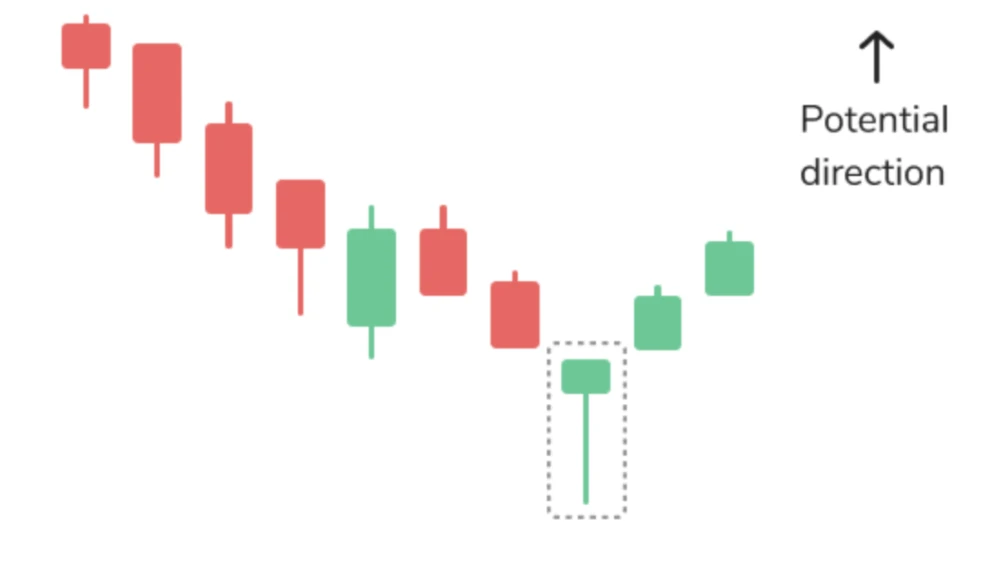
Conversely, if the wick at the bottom of a candle is short, it suggests that people are still selling the coin. This adds to the supply and suggests the price is likely to go down even further. However, if the wick at the bottom is quite long, then it suggests the price of the coin has already dipped, and people have started buying it again, hoping to get it at its lowest value. This may result in an upward movement on the following day. This can be seen in the hammer candlestick pattern (below). It represents a short body with a lower tail and can be seen at the bottom of the downward trend.
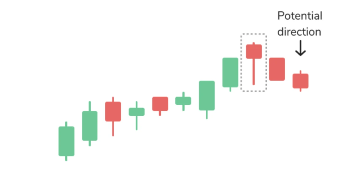
An example of bearish candlestick patterns is the hanging man. This has the same form as a hammer, but it can be found at the end of the upwards trend, so the closing price in this case is lower than the opening price.
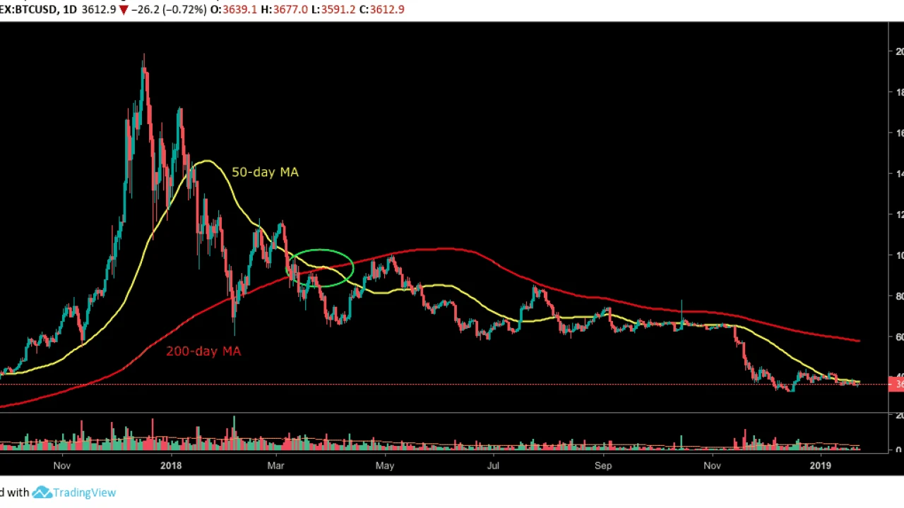
Finally, another important line you will likely encounter when analysing crypto charts is moving average indicators. These lines are based on the average closing price of a coin over a specified period of time.This indicator is useful for seeing patterns and helping to determine trends and signals for entering and exiting positions.
For example, you would calculate a 50 day moving average by adding up the closing prices of a coin for each of the 50 trading days prior to that day and dividing it by 50.
To make it easier, let’s say we want a 5 day moving average. The price action over the 5 days prior was $10, $8, $12, $15, and then $20. The moving average therefore will be the sum of these figures, divided by 5, which is 13.
And there you have it – the basics of cryptocurrency charts. If you have any more questions about different areas of the mean, feel free to reach out to us on Twitter. In the next blog in this series, we’ll be going into more detail about how to actually use these charts to predict future price movements using technical analysis, focusing on trend lines, resistance levels, and more.
Always remember to make smart decisions and do your own research!
*We are not financial advisors. In order to make the best financial decision that suits your own needs, you must conduct your own research and seek the advice of a licensed financial advisor if necessary. Know that all investments involve some form of risk and there is no guarantee that you will be successful in making, saving, or investing money; nor is there any guarantee that you won't experience any loss when investing.
Buy, store, and manage your investments with confidence
Join Markethive - the only Market Network on Blockchain, click HERE
.jpg)
About: Andries vanTonder
Over 40 years selfemployed
He is a Serial Entrepreneur, an Enthusiastic supporter of Blockchain Technology and a Cryptocurrency Investor
Find me at my Markethive Profile Page | My Twitter Account | My Instagram Acount | and my Facebook Profile.
