x


Cryptocurrency Trading Jargon Explained
When you first start taking an interest in almost anything new there is aften a lot of jargon or TLA's (three letter abbreviations). This is particularly so with technology and finance. Here are a few of the common terms you may come across.. I acknowledge that much of what I have included here comes from tradition stock market analysis and while the tools are still valid the volatility of the cryptocurrency market may make the use of some tools difficult. The key point to remember is that no one tool is perfect and much like weather forecasting they can only be considered just that ... a forcast.. This is PART 1 of 3
The Relative Strength Index (RSI) describes a momentum indicator that measures the magnitude of recent price changes in order to evaluate overbought or oversold conditions in the price of a stock or other asset.
The Relative Strength Index (RSI) is one of the most powerful indicators across all markets, and the cryptocurrency market is no exception. It is a very simple indicator which makes it an ideal place to start learning technical analysis.
The RSI indicator’s main role is to identify the relationship between the price and the real offer/demand. Spotting areas where coins are at the peak of their strength, or bottom of their weakness is where this indicator becomes incredibly useful.
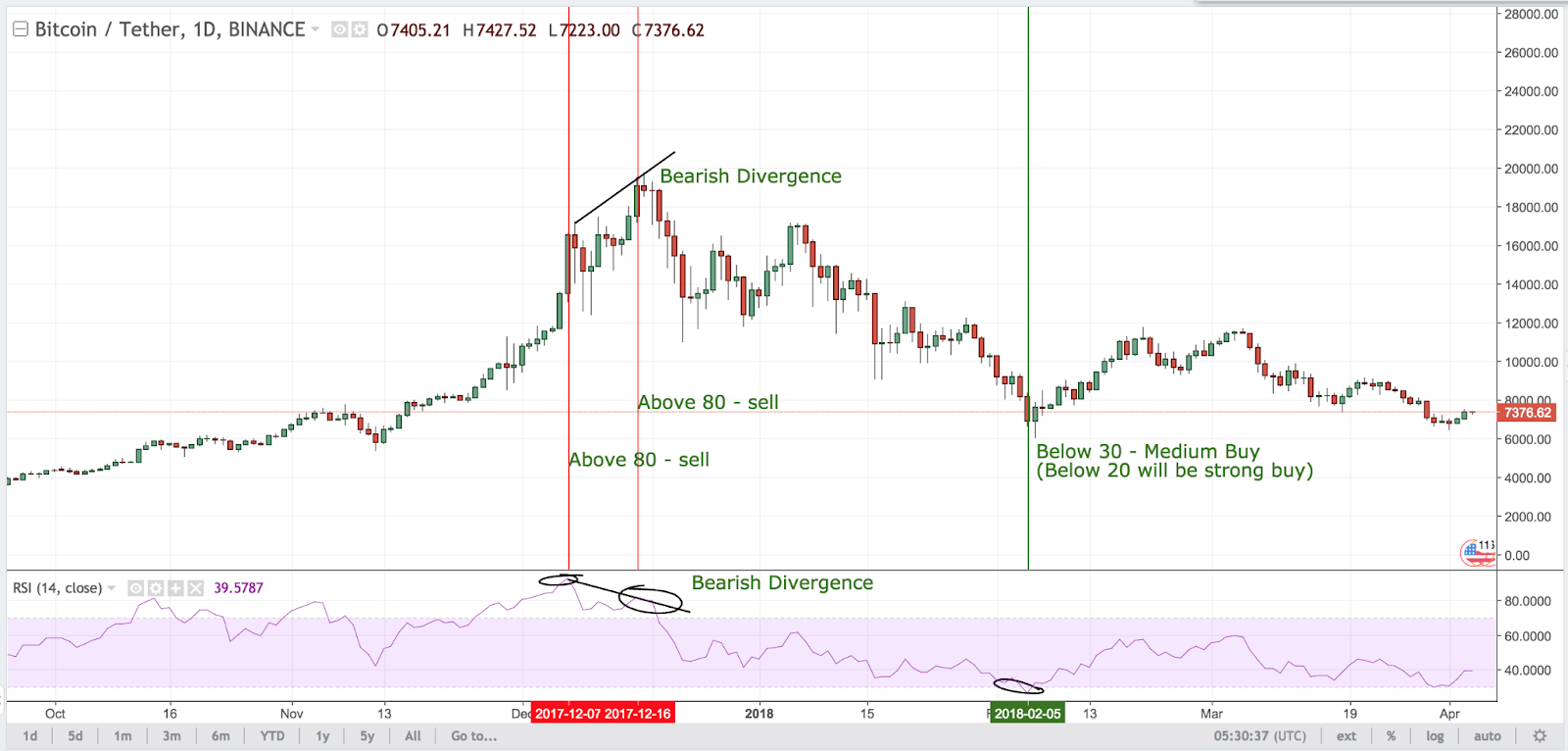
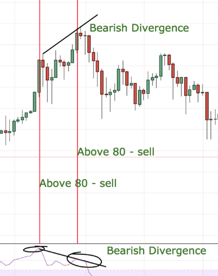
The market provides an overbought signal when the RSI line crosses the 70 and an oversold signal when the RSI line crosses 30.
Overbought = Sell signal
Oversold = Buy signal
There is an extra layer to this interpretation however. A trader can also use the indicators 80/20 or even 85/15 instead of the traditional 70/30. This gives a far stronger signal, since it is very rare that the market can maintain it’s current momentum by the time the RSI indicator is signaling above 80 or below 20.
Working this way you can see that in the chart above there have been two strong sell signals and one medium buy signal issued by the RSI indicator since October 2017.
The other signal that the RSI indicator has provided us was what is called a “bearish divergence” a divergence can be spotted when the RSI indicator is moving the opposite direction to the price. In this scenario the RSI moved down as Bitcoin jumped from $16,000 to $20,000.
A bearish divergence, true to it’s name is a very strong sell signal which is usually followed by a rapid drop in price, as you can see on the chart. The strength of the signal is also increased as the RSI is above 80, already a strong sell signal that the asset is overbought.
It is also important to view multiple timeframes for example 1d, 6h, 1h to get a better indication of where the price is moving in the short, mid or long time periods.
The RSI indicator is a powerful tool that has withstood the test of time. Although it is never wise to follow any single indicator blindly, the relative strength index is one of the most commonly mentioned and traded indicators in the cryptocurrency market.
Bollinger Bands:
A Bollinger band is commonly used as a visual indicator for estimating the volatility of a charted asset. ... Of the two common trading strategies using bollinger band, breakout trades are more relevant for cryptocurrencies, due to the high volatility of the asset class.
A bollinger band is a technical analysis tool named after the esteemed technical trader who designed it — John Bollinger. Bollinger bands consist of three lines:
As shown in the chart above, bollinger bands are applied to the daily chart of BTC/USD traded at Coinbase. The upper band is plotted two standard deviations above the 20 period MA, while the lower band is plotted two standard deviations below. Standard deviation measures the difference between a group of values from the mean, making it a good indicator of volatility. As the bands expand, it indicates that the market is becoming more volatile as prices move away from the lagging 20 MA. As bands contract, it indicates that the market is becoming less volatile.
How Do Traders Use Bollinger Bands?
As bollinger bands measure volatility, or lack thereof, there are two ways that traders can construct strategies around them.
Using Bollinger Bands for Mean Reversion
The first way traders utilize bollinger bands is to wait for the market to approach the upper or lower bands before taking action. As the price trades closer towards the bands, the possibility becomes greater that the market is overbought (upper band) or oversold (lower band). Hence, the mean reversion trader will execute a short when the price touches the upper band, and a long when the price touches the lower.
Caution: this simplistic strategy may not be the most applicable for explosive and trending markets like Bitcoin or cryptocurrencies. Mean reversion may be more suited for less volatile markets.
Using Bollinger Bands for Breakout Trades
The second way traders utilize Bollinger Bands is to trade breakouts. This is done by executing a trade in the direction that the price breaches the band. If the price breaches the top band, enter a long position, and if price breaches the lower band, enter a short. This is best executed in tandem with the bands narrowing, which could be a good signal that the market is readying itself for an explosive move.
A simple strategy would look something like this:
Using bollinger bands for breakout trades on Bitcoin or other cryptocurrencies is recommended over mean reversion trades, as cryptocurrencies are extremely volatile and tend to trend for prolonged periods. Do your own research before trading!
How Are Bollinger Bands Calculated?
The formula to calculate bollinger bands are as follows:
Middle Band = MA[Source Price, n]
Upper Band = MA[Source Price, n] + (m * n period standard deviation)
Lower Band = MA[Source Price, n] - (m * n period standard deviation)
Where source price can be open, high, low, close, etc.
n = number of periods (chosen by user)
m = standard deviations (chosen by user)
By J.B. MAVERICK Updated May 4, 2020
The 50-day simple moving average (SMA) is commonly plotted on charts and utilized by traders and market analysts because historical analysis of price movements shows it to be an effective trend indicator.
The 50-, 100- and 200-day moving averages are probably among the most commonly found lines drawn on any trader or analyst's charts. All three are considered major, or significant, moving averages and represent levels of support or resistance in a market.
The 50-day moving average is the leading of the three averages and is, therefore, the first line of major moving average support in an uptrend or the first line of major moving average resistance in a downtrend.
As noted, the 50-day moving average is widely used because it works well. The more accurate a moving average is as a trend indicator, the more useful it is for traders and analysts. The ideal moving average shows a level that price will not likely violate on a mere temporary retracement, thus possibly giving a false market reversal signal. It can also be used to place a trailing stop on an existing market position.
Additionally, it is helpful if the moving average is a level that price will approach on retracements and can, therefore, be used to make additional market entries. Through trial and error using various moving averages, the 50-day moving average has served these purposes well.
In a sustained uptrend, the price generally remains above the 50-day moving average, and the 50-day moving average remains above the 100-day moving average. If the price moves significantly below the 50-period moving average, and especially if it closes below that level, it is commonly interpreted by analysts as signaling a possible trend change to the downside. The 50-day moving average crossing below and remaining below the 100-day moving average gives the same signal.
Long-term trend traders commonly use the 50-day SMA, whereas intraday stock or forex traders often employ a 50-day exponential moving average or EMA on a one-hour chart.
The key downside to the 50-day moving average is that it uses historical data. There are times that the market tends to follow moving average support and resistance levels, but at other times the indicators get no respect.
The 50-day average can perform well during strong market conditions, but not-so-well during unpredictable or choppy markets. Some of this uncertainty can be mitigated by adjusting the time frame.
Stochastic RSI, or simply StochRSI, is a technical analysis indicator used to determine whether an asset is overbought or oversold, as well as to identify current market trends. ... It is frequently used by stock traders, but may also be applied to other trading contexts, such as Forex and cryptocurrency market
Stochastic RSI, or simply StochRSI, is a technical analysis indicator used to determine whether an asset is overbought or oversold, as well as to identify current market trends. As the name suggests, the StochRSI is a derivative of the standard Relative Strength Index (RSI) and, as such, is considered an indicator of an indicator. It is a type of oscillator, meaning that it fluctuates above and below a center line.
The StochRSI was first described in the 1994 book titled The New Technical Trader by Stanley Kroll and Tushar Chande. It is frequently used by stock traders, but may also be applied to other trading contexts, such as Forex and cryptocurrency markets.
How does StochRSI work?
The StochRSI indicator is generated from the ordinary RSI by applying the Stochastic Oscillator formula. The result is a single numerical rating that swings around a centerline (0.5), within a 0-1 range. However, there are modified versions of the StochRSI indicator that multiply the results by 100, so the values range between 0 and 100 instead of 0 and 1. It is also common to see a 3-day simple moving average (SMA) along with the StochRSI line, which acts as a signal line and is meant to reduce the risks of trading on false signals.
The standard Stochastic Oscillator formula considers an asset’s closing price along with its highest and lowest points within a set period. However, when the formula is used to calculate the StochRSI, it is directly applied to the RSI data (prices are not considered).
Stoch RSI = (Current RSI - Lowest RSI)/(Highest RSI - Lowest RSI)
Just like the standard RSI, the most common time setting used for the StochRSI is 14 periods. The 14 periods involved in the StochRSI calculation are based on the chart time frame. So, while a daily chart would consider the past 14 days (candlesticks), an hourly chart would generate the StochRSI based on the last 14 hours.
The periods could be set to days, hours or even minutes, and their use varies significantly from trader to trader (according to their profile and strategy). The number of periods can also be adjusted up or down to identify longer-term or shorter-term trends. A 20-period setting is another fairly popular option for the StochRSI indicator.
As mentioned, some StochRSI charting patterns assign values ranging from 0 to 100 instead of 0 to 1. On these charts, the centerline is at 50 instead of 0.5. Therefore, the overbought signal that usually occurs at 0.8 would be denoted at 80, and the oversold signal at 20 rather than 0.2. Charts with a 0-100 setting may look slightly different, but the practical interpretation is essentially the same.
The StochRSI indicator takes on its greatest significance near the upper and lower bounds of its range. Therefore, the primary use of the indicator is to identify potential entry and exit points, as well as price reversals. So, a reading of 0.2 or below indicates that an asset is probably oversold, while a reading of 0.8 or above suggests that it is likely to be overbought.
In addition, readings that are closer to the centerline can also provide useful information in regards to market trends. For instance, when the centerline acts as a support and the StochRSI lines move steadily above the 0.5 mark, it may suggest the continuation of a bullish or upward trend - especially if the lines start to move toward 0.8. Likewise, readings consistently below 0.5 and trending toward 0.2 indicate a downward or bearish trend.
Both StochRSI and RSI are banded oscillator indicators that make it easier for traders to identify potential overbought and oversold conditions, as well as possible reversal points. In short, the standard RSI is a metric used to track how quickly and to what degree the prices of an asset change in relation to a set time frame (period).
However, when compared to the Stochastic RSI, the standard RSI is a relatively slow-moving indicator that produces a small number of trading signals. The application of the Stochastic Oscillator formula to the regular RSI allowed the creation of the StochRSI as an indicator with increased sensitivity. Consequently, the number of signals it produces is much higher, giving traders more opportunities to identify market trends and potential buying or selling points.
In other words, the StochRSI is a fairly volatile indicator, and while this makes it a more sensitive TA tool that can help traders with an increased number of trading signals, it is also riskier because it often generates a fair amount of noise (false signals). As mentioned, applying simple moving averages (SMA) is one common method for reducing the risks associated with these false signals and, in many cases, a 3-day SMA is already included as a default setting for the StochRSI indicator.
Because of its greater speed and sensitivity to market movements, the Stochastic RSI can be a very useful indicator for analysts, traders, and investors - for both short-term and long-term analysis. However, more signals also mean more risk and, for this reason, the StochRSI should be used alongside other technical analysis tools that may help to confirm the signals it creates. It is also important to keep in mind that the cryptocurrency markets are more volatile than the traditional ones and, as such, may generate an increased number of false signals.
The Awesome Oscillator (AO) is an indicator used to measure market momentum. AO calculates the difference between a 34 Period and 5 Period Simple Moving Average. The Simple Moving Averages that are used are not calculated using closing price but rather each bar's midpoints. ... Read more about the Awesome Oscillator (AO).
This indicator is based on Bill Williams` recommendations from his book
"New Trading Dimensions". We recommend this book to you as most useful reading.
The wisdom, technical expertise, and skillful teaching style of Williams make
it a truly revolutionary-level source. A must-have new book for stock and
commodity traders.
The 1st 2 chapters are somewhat of ramble where the author describes the
"metaphysics" of trading. Still some good ideas are offered. The book references
chaos theory, and leaves it up to the reader to believe whether "supercomputers"
were used in formulating the various trading methods (the author wants to come across
as an applied mathemetician, but he sure looks like a stock trader). There isn't any
obvious connection with Chaos Theory - despite of the weak link between the title and
content, the trading methodologies do work. Most readers think the author's systems to
be a perfect filter and trigger for a short term trading system. He states a goal of
10%/month, but when these filters & axioms are correctly combined with a good momentum
system, much more is a probable result.
There's better written & more informative books out there for less money, but this author
does have the "Holy Grail" of stock trading. A set of filters, axioms, and methods which are
the "missing link" for any trading system which is based upon conventional indicators.
This indicator plots the oscillator as a histogram where periods fit for buying are marked
as blue, and periods fit for selling as red. If the current value of AC ( Awesome Oscillator )
is over the previous, the period is deemed fit for buying and the indicator is marked blue.
If the AC values is not over the previous, the period is deemed fir for selling and the indicator
is marked red.
Definition. Chaikin Money Flow (CMF) is a technical analysis indicator used to measure Money Flow Volume over a set period of time. Money Flow Volume (a concept also created by Marc Chaikin) is a metric used to measure the buying and selling pressure of a security for single period.
Definition
Chaikin Money Flow (CMF) is a technical analysis indicator used to measure Money Flow Volume over a set period of time. Money Flow Volume (a concept also created by Marc Chaikin) is a metric used to measure the buying and selling pressure of a security for single period. CMF then sums Money Flow Volume over a user defined look-back period. Any look-back period can be used however the most popular settings would be 20 or 21 days. Chaikin Money Flow's Value fluctuates between 1 and -1. CMF can be used as a way to further quantify changes in buying and selling pressure and can help to anticipate future changes and therefore trading opportunities.
.png)
Chaikin Money Flow was created by famed stock analyst Marc Chaikin. The Chaikin Money Flow has become closely related to two of Chaikin’s other famous indicators; the Chaikin Oscillator and Accumulation/Distribution.
The calculation for Chaikin Money Flow (CMF) has three distinct steps (for this example we will use a 21 Period CMF):
1. Find the Money Flow Multiplier
[(Close - Low) - (High - Close)] /(High - Low) = Money Flow Multiplier
2. Calculate Money Flow Volume
Money Flow Multiplier x Volume for the Period = Money Flow Volume
3. Calculate The CMF
21 Period Sum of Money Flow Volume / 21 Period Sum of Volume = 21 Period CMF
Chaikin believed that buying and selling pressures could be determined by where a period closes in relation to its high/low range. If the period closes in the upper half of the range, then buying pressure is higher and if the period closes in the lower half of the range, then selling pressure is higher. This is what the Money Flow Multiplier determines (step 1 in the calculation above). The Money Flow Multiplier is what determines The Money Flow Volume and therefore, ultimately Chaikin Money Flow (CMF).
Chaikin's Money Flow's value fluctuates between 1 and -1. The basic interpretation is:
What to look for
Buying and Selling Pressure can be a good way to confirm an ongoing trend. This can give the trader an added level of confidence that the current trend is likely to continue.
During a Bullish Trend, continuous Buying Pressure (Chaikin Money Flow values above 0) can indicate that prices will continue to rise.
During a Bearish Trend, continuous Selling Pressure (Chaikin Money Flow values below 0) can indicate that prices will continue to fall.
.png)
Crosses
When Chaikin Money Flow crosses the Zero Line, this can be an indication that there is an impending trend reversal.
Bullish Crosses occur when Chaikin Money Flow crosses from below the Zero Line to above the Zero Line. Price then rises.
.png)
Bearish Crosses occur when Chaikin Money Flow crosses from above the Zero Line to below the Zero Line. Price then falls.
.png)
It should be noted that brief crosses can occur resulting in false signals. The best way to avoid these false signals is by examining past performance for the particular security that is being analyzed and even adjusting the thresholds accordingly. For example, instead of a Zero Line Cross, a technical analyst may use two separate lines such as .05 and -.05.
Chaikin Money Flow does have a shortfall in its calculation. The shortfall is that the Money Flow Multiplier, which plays into determining Money Flow Volume and therefore Chaikin Money Flow values, does not take into account the change in trading range between periods. This means that if there is any type of gap in price, it won’t be picked up on and therefore Chaikin Money Flow and price will become out of sync.
.png)
Chaikin Money flow is a nice indictor that gives the technical analyst another view of Chaikin's theories about buying and selling pressure. It should not necessarily be used by itself as a stand-alone signal generating indicator. CMF works well when in conjunction with additional indicators, especially those indicators that were also generated by Chaikin; Accumulation/Distribution (ADL) and The Chaikin Oscillator.
The time period to be used in calculating Chaikin Money Flow.
Style
Can toggle the visibility of the Money Flow Line as well as the visibility of a price line showing the actual current value of Money Flow. Can also select the Money Flow Line's color, line thickness and visual type (Line is the default).
Can toggle the visibility of the Zero Line. Can also select the Zero Line's value, color, line thickness and visual type (Dashes are the default).
Sets the number of decimal places to be left on the indicator's value before rounding up. The higher this number, the more decimal points will be on the indicator's value.
Chaikin; Accumulation/Distribution (ADL)
Developed by Marc Chaikin, the Accumulation Distribution Line is a volume-based indicator designed to measure the cumulative flow of money into and out of a security. Chaikin originally referred to the indicator as the Cumulative Money Flow Line
The accumulation/distribution (A/D) line gauges supply and demand of an asset or security by looking at where the price closed within the period's range and then multiplying that by volume. The A/D indicator is cumulative, meaning one period's value is added or subtracted from the last.
By CORY MITCHELL Reviewed by CHARLES POTTERS Updated May 17, 2021
The accumulation/distribution indicator (A/D) is a cumulative indicator that uses volume and price to assess whether a stock is being accumulated or distributed. The A/D measure seeks to identify divergences between the stock price and volume flow. This provides insight into how strong a trend is. If the price is rising but the indicator is falling it suggests that buying or accumulation volume may not be enough to support the price rise and a price decline could be forthcoming.
In Part 2 I cover;
Fibonacci Levels
Fibonacci retracement
12 Popular Candlestick Patterns Used in Technical Analysis
POINT TO REMEMBER: Often the purpose of writing a blog is to educate the writer as much as those that read the blog. Therefore I am open to criticism about the content etc but in the meantime I have learnt quite a lot.


