


The Markethive Social Market Broadcasting Network becomes more prominent daily as the blockchain-driven ecosystem for entrepreneurs with a non-adversarial, bi-partisan free speech ethic and the collaborative culture we rarely see on social media platforms today. Even the newer acclaimed free speech platforms are partisan to the left or right and deal with deplatforming and boycotts from payment providers.
It’s widely notorious that the actions of the tech giants have divided nations and are the source of countless societal harms, including rampant censorship, promoting violent extremism, spreading false information, and unfairly stamping out its competition.
Instead of improving the user experience to one that users would welcome, legacy big tech is somewhat distracted by its self-induced problems. It’s now under scrutiny by government policymakers with the overall consensus that something should be done to reign in the centralized power or structurally break up the technocracy.
To circumvent this, Facebook is focused on updating the internet with new regulations to appease critics and leverage its new Oversight Board, while Twitter grapples at the idea of integrating a more decentralized approach to the platform, specifically giving users an algorithmic choice by opening up its news feed to third party algorithms selected by its users, which could undoubtedly customize the user experience, but still be under a central authority.
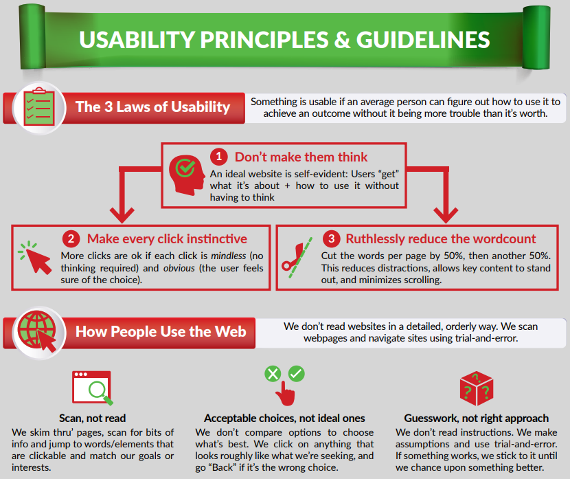
Known for its evolutionary and innovative ethos, Markethive continues to expand its decentralized “all-in-one” platform with the development of a unique news feed interface that completely embodies the user experience (UX) in the framework of “don’t make me think.” A concept brought to light by author Steve Krug, a usability expert, cites that usability is fundamentally about human psychology.
The book “Don’t Make Me Think” was first written in 2000 and revised in 2013. Since the turn of the century, technology has changed rapidly. Yet, the principles in the book remain the same because something is only considered usable if an average person can figure out how to use it to achieve an outcome without it being more trouble than it’s worth. Krug breaks this down into three laws as shown in this infographic below:
Key Quote
“Usability is about people and how they understand and use things, not about technology
...while technology often changes quickly, people change very slowly.”
Once it is understood how the human brain works, these same insights can continue to be applied even as technology and landscapes evolve. So usability is not just about technology; it’s about understanding how people think and behave to build better things, giving the user a more seamless and more straightforward experience when navigating.
Unlike the social media giants, which only have one primary news feed that is algorithmically set by the central authorities, Markethive is introducing four news feeds to accommodate the multi-functional platform within the Markethive ecosystem. The individual feeds are General, Video, Blogging, and Content Curation. They are all accessible from the main page and can be algorithmically set by the individual user.
The scope that Markethive has is enormous as it integrates all the vertical systems of the other platforms under one roof.
Social + Video + Blogging + Marketing + Curation + Broadcasting = Markethive.
It’s a monumental project that can be overwhelming for the average person. It’s no wonder social media platforms are predominantly single-function and centralized. Technology has advanced with Blockchain, and Crypto is becoming ubiquitous and gives rise to the decentralized, privacy, and autonomy components of social media. Something that the established dinosaurs would find near impossible to integrate at its highest level.
Enter Markethive, and although it has enjoyed longevity, it can integrate cutting-edge and unique systems. It is next-level, delivering every function and aspect available, fitting for the entrepreneur, business, and corporation. A clean design, not cluttered, intuitive for easy navigation, and simple to carry out tasks for all users on every level is crucial for website stickiness and the overall success of our entrepreneurial users.
The following images are a basic mockup or draft, subject to enhancements, to give you an idea of how the new main page will look with the various news feeds and menus. It is definitely something to look forward to upon its integration.
As quoted by CEO and Founder of Markethive, Thomas Prendergast,
“We are making major changes right now to the entire layout and aspects of the system. New look, better navigation, rebuilt Page making system, improved alert system, all in preparation of the Wallet.
Understand this major uplifting has been in the works for several months, and we are close to its completion. Along with this are new upgrades, The Boost, The Wheel Of Fortune, The Premium Upgrades, etc.”
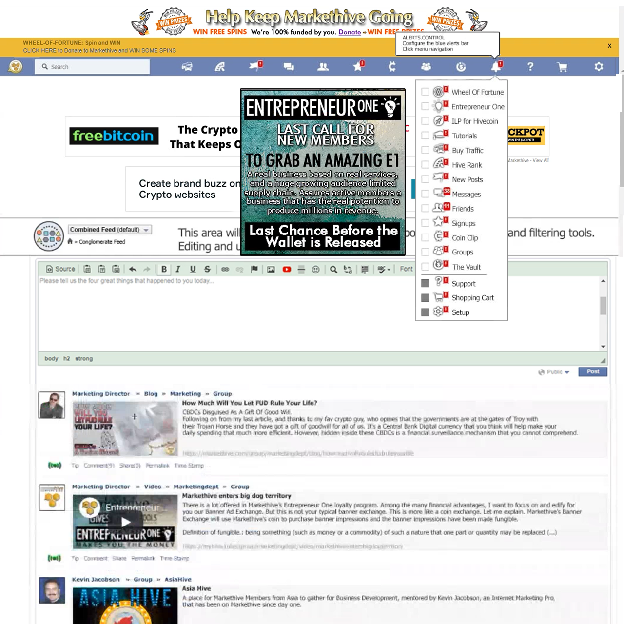
The format is horizontal, not vertical, like many other websites making it more readable and less time-consuming in terms of navigation. The vertical side menus are gone, along with the busy text in the blue bar.
At the top of the main page are the Super Banners. This is prime real estate and specifically for Markethive, the company. There are currently three banners to be displayed in this space;
Anyone else inside or outside of Markethive wanting to place a banner there will pay top dollar.
The real estate below the blue bar is for the markethive community and placement of their banners.
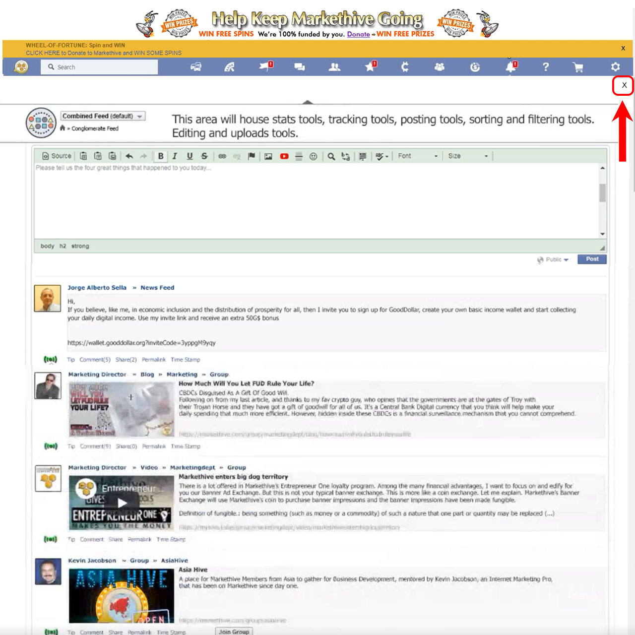
The X in the top right corner, when clicked, removes the Banners and tray, allowing the HTML editor and news feeds to move upwards. Clearing that real estate gives you more space to work, which can be very handy on a small screen like a mobile or tablet.
This feature is for Entrepreneur one upgrades only, so the X will only be visible to upgraded accounts. The banners and tray will continue to be hidden while the user is active within Markethive. They will return and be visible once the user becomes inactive for 30 minutes or more or logs out.
There will also be Markethive floating banner ads which can be closed for a thirty-minute period unless you’re an upgrade, in which case it stays closed for the duration of your stay. If clicked on, it will take you directly to the area any given banner stipulates. For example, the Wheel Of Fortune floating banner, shown in the image below, will take you directly to the shopping cart.
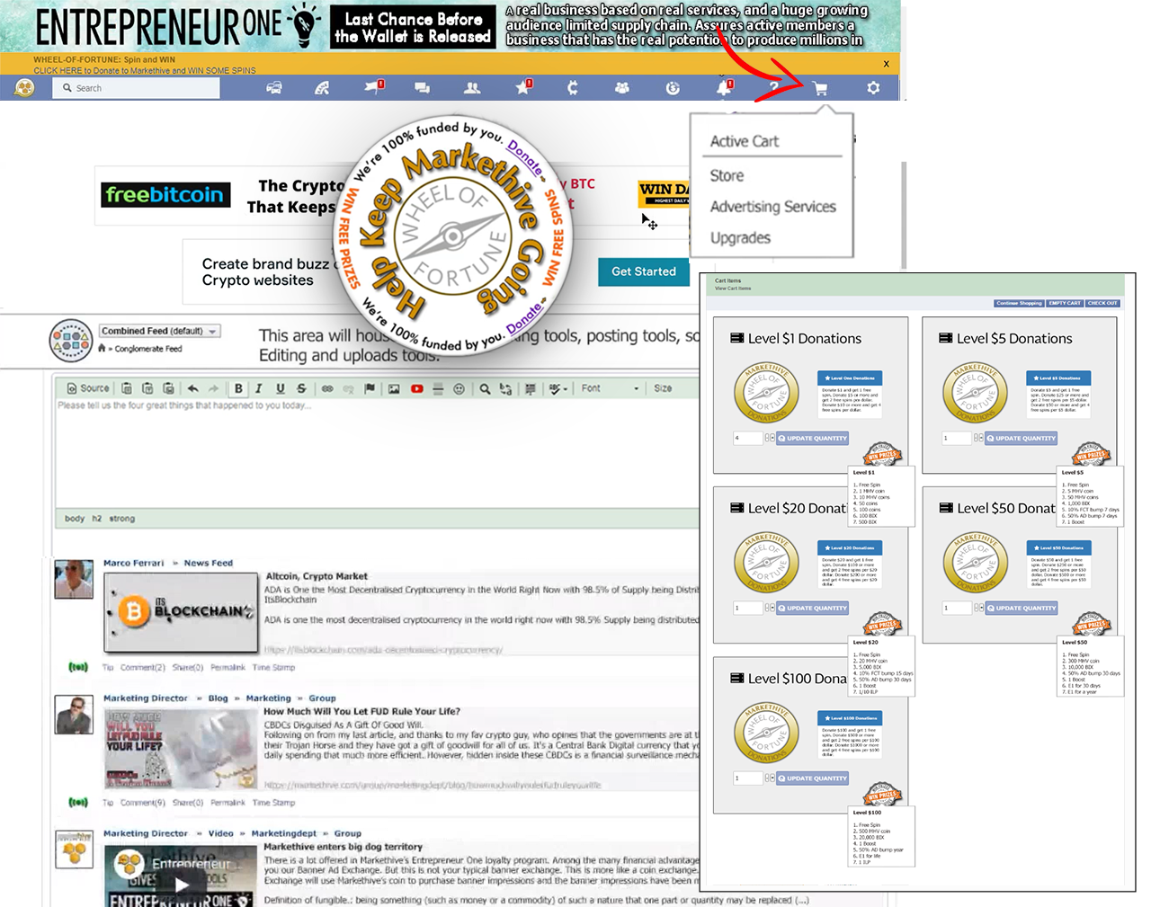
There are numerous floating banners, as described below, that will sequentially be displayed, giving you easy access to wherever you choose to go with just a simple click on the banner.

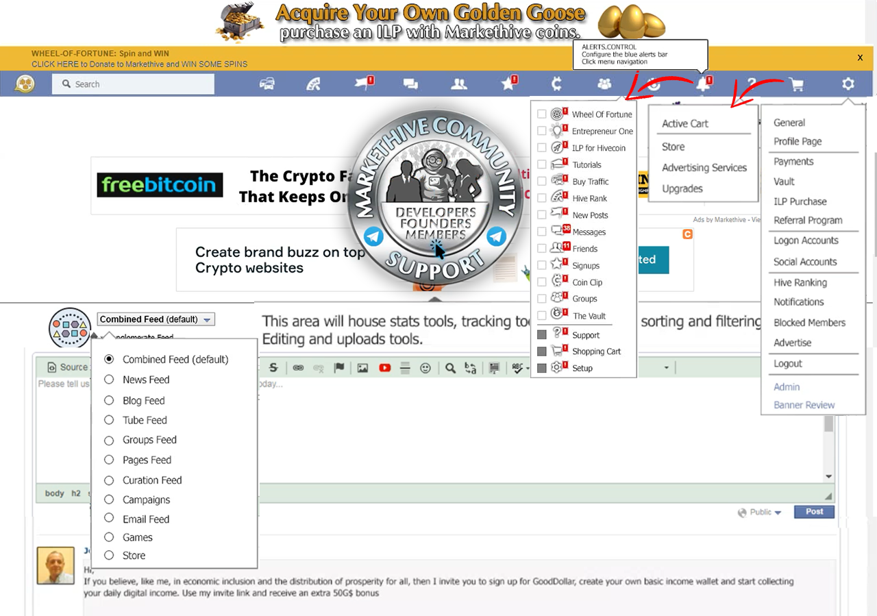
Multiple pulldown menus will be replacing the side menus on the main news feed page and the profile page. These are now all accessible on one page on the blue bar under Settings, Shopping Cart, and the Notifications bell icon also named Alerts Control. This allows you to configure the blue alerts bar and provides click menu navigation.
All the settings displayed that could only be accessed on the left of the profile page are now accessed on the main interface, including general profile page settings, payments, Vault, ILP purchases, login account, social accounts, and hive ranking. This makes it a lot easier to navigate and is much more intuitive.
There is also a pull-down menu under Shopping Cart that displays the status of your cart (whether it’s empty or has items pending in it).
The shopping cart menu takes you to the Markethive store and the Advertising services, which are strictly for the Markethive Press Release program, the Boost, social network broadcasting, digital banner advertising, and video advertising. As these services are introduced, you will find them in this pull-down menu.
A series of upgrades will also be displayed under the shopping cart. Currently, there is the E1 upgrade and soon to be added the Apprentice Upgrade, which will be renamed the Premium Upgrade. There will ultimately be multiple levels of premium upgrades which will all be located in the shopping cart pull-down menu.
For the purpose of this article, the image below displays all pull-drown menus opened and can be accessed by clicking on their respective icon.
Now for the pièce de résistance and Markethive’s claim to fame. The combined news feed interface is a first in the social media environment. It includes the four primary feeds being the general Newsfeed, Blog, Video, and Curation feed.
So what’s the big deal about a news feed?
The news feed is the heart and lungs of Markethive. Everything around it is the bones or structure of Markethive. It all starts at the center, being the newsfeeds and works outwards and is the dashboard or control center, where every aspect of Markethive is easily accessible.
The combined pulldown menu also includes the Groups feed, Campaigns, Games, Store, and Email feed which can also be set algorithmically by you. You choose what and who you want to see in your combined news feed.
You can choose only to see what you’ve posted, select by geo-location, friends, Tube feed, Blog feed, Group feed, etc. You can access these configuration tools in the tray just above the HTML editor, housing the stats tools, tracking devices, posting tools, sorting and filtering tools, editing, and upload tools.
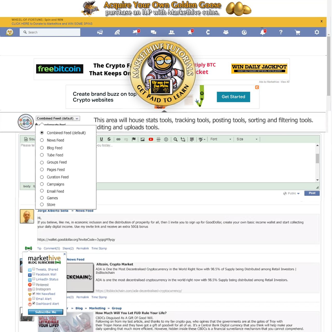
Posting in a news feed has become a lot more exciting with the ability to stylize your text (bold, italics, text size, font type, hyperlinks) add embed videos and images, similar to the current blog editor.
Whatever task you do, you will access it from the combined feed pull-down menu. For example, if you want to upload a video in the Tube Feed, it will open up the tool page for you to upload it.
You do not leave the main page for any task you perform. This is where you access all your interfaces. E.g., The video upload interface, the blogging platform, the curation control panel, etc. You will be able to add, edit and monitor everything you do right from the main page.
Whatever you choose to see in your combined feed will be displayed: Videos from the Tube Feed, Blogs, Capture Pages, Groups feed, General postings, everything will be displayed on the page.
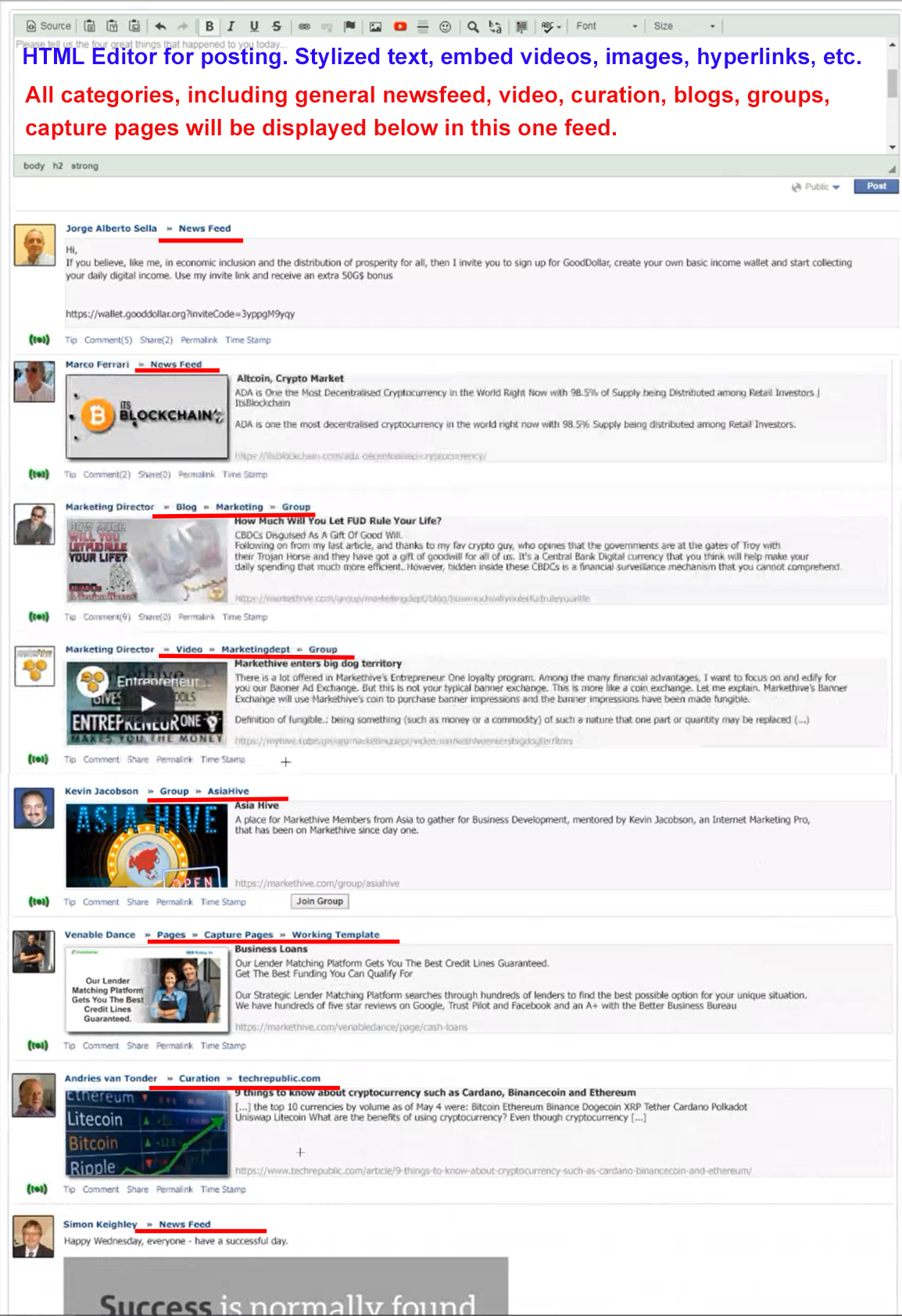
You will also be able to subscribe to any post in your news feed right from the main page. Each post generates a permalink that will show when the post is broadcasted to other social media sites, displaying the profile page with a summary of the post as illustrated in the image below.
The comments are also displayed in the permalink popup. When clicked on to view or comment, it’ll forward the viewer to Markethive. If the viewer is not a member, a registration banner will pop up inviting them to join Markethive.
Clicking on the permalink also allows the viewer to peruse your other posts. You can also tip and comment on the post on the main newsfeed page or the permalink popup. The timestamp displayed next to the permalink will show the hour, day, month, and year. No more wondering what year the post was posted!
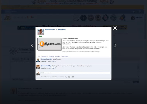
Everything is at your fingertips on this one page, making it very intuitive and mobile-friendly. The dynamics will change completely, and you won’t have to navigate to individual pages within the Markethive system. All configuration, filtering, and searching are done right from the combined news feed interface.
Posting any of your content remotely, whether it be blogs, videos, or general newsfeed posts, will be made instantaneous and straightforward with the new interface. Markethive will be infiltrating every corner of the internet universe and become a household name.
The whole interface is streamlined and purposely created in a horizontal fashion with minimal to no advertising, so it is not overwhelming for the average and new user. So many websites, blogs, and digital media articles are so cluttered up with vertical side columns and advertisements, making it annoying and virtually impossible to read or comment on the site.
Markethive has always been a pioneer and ahead of the curve, initiating a social network before social media became a thing, starting with Veretekk in the nineties. It is a Divine inspiration, a vision that is coming to light. It’s one of integrity and can command authority with its clean, polished new look and navigation.
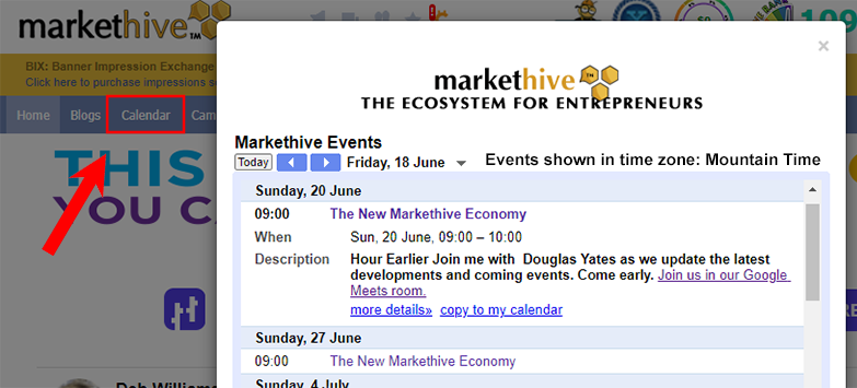
So what we have here is an outline of just part of what’s coming in Markethive. There is much more to this monolithic concept and project, and all of this is discussed at the Markethive meetings every Sunday at 9 am Mountain Time. (MDT)
So what time is it in your part of the world? Go here to find out. The doors to the meeting room are closed 5 minutes after commencement. Latecomers are denied access, so get there early.
You can keep yourself up to date with the latest news and developments of Markethive as they happen. To access the meeting room, go to the Calendar and click on the link provided. See you there!
A special thank you to the founders Thomas, Douglas, and Annette for their insights, inspiration, and dedication to bring the next generation social market broadcasting platform, far removed from the chaos of the legacy tech giants. A completely, decentralized ecosystem, impervious to the tyrannical forces that have subjugated humanity. Welcome aboard to all and be ready for an exciting transition and transformation of Markethive.
To join Markethive for FREE click on the image below:

Written by Deb Williams
Chief Editor and writer for Markethive.com, the social, market, broadcasting network. An avid supporter of blockchain technology and cryptocurrency. I thrive on progress and champion freedom of speech and sovereignty. I embrace "Change" with a passion, and my purpose in life is to enlighten people en masse, accept and move forward with enthusiasm.
